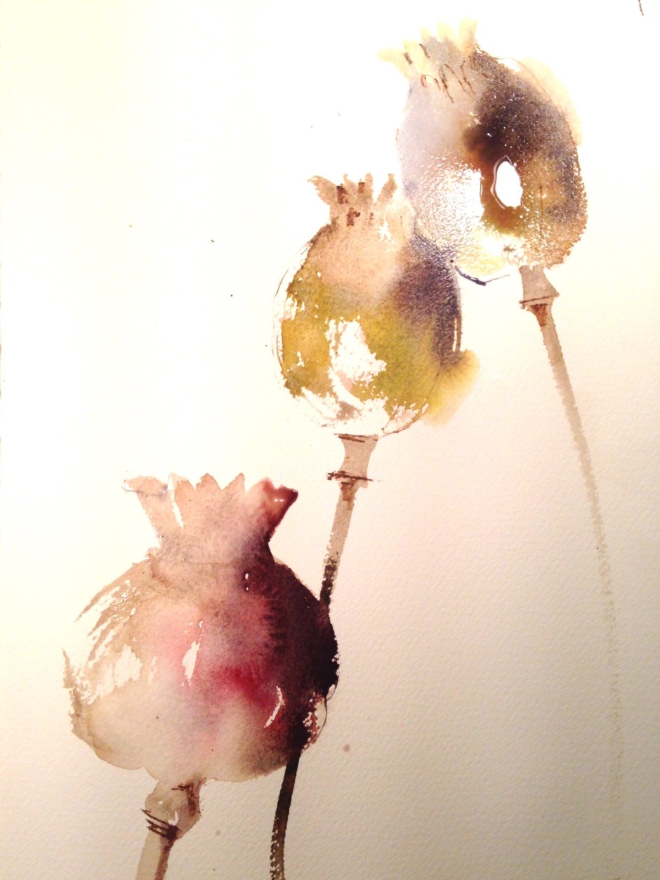
A study, using alizarin crimson, ultramarine blue, raw umber, burnt sienna and raw sienna. I’m working with Chinese brushes. I felt the initial effort didn’t work, too much empty space, not enough opportunity for layering and adding a bit of that watercolour magic that is negative painting, so I washed the page down leaving a ghost of the first image. Initial painting below
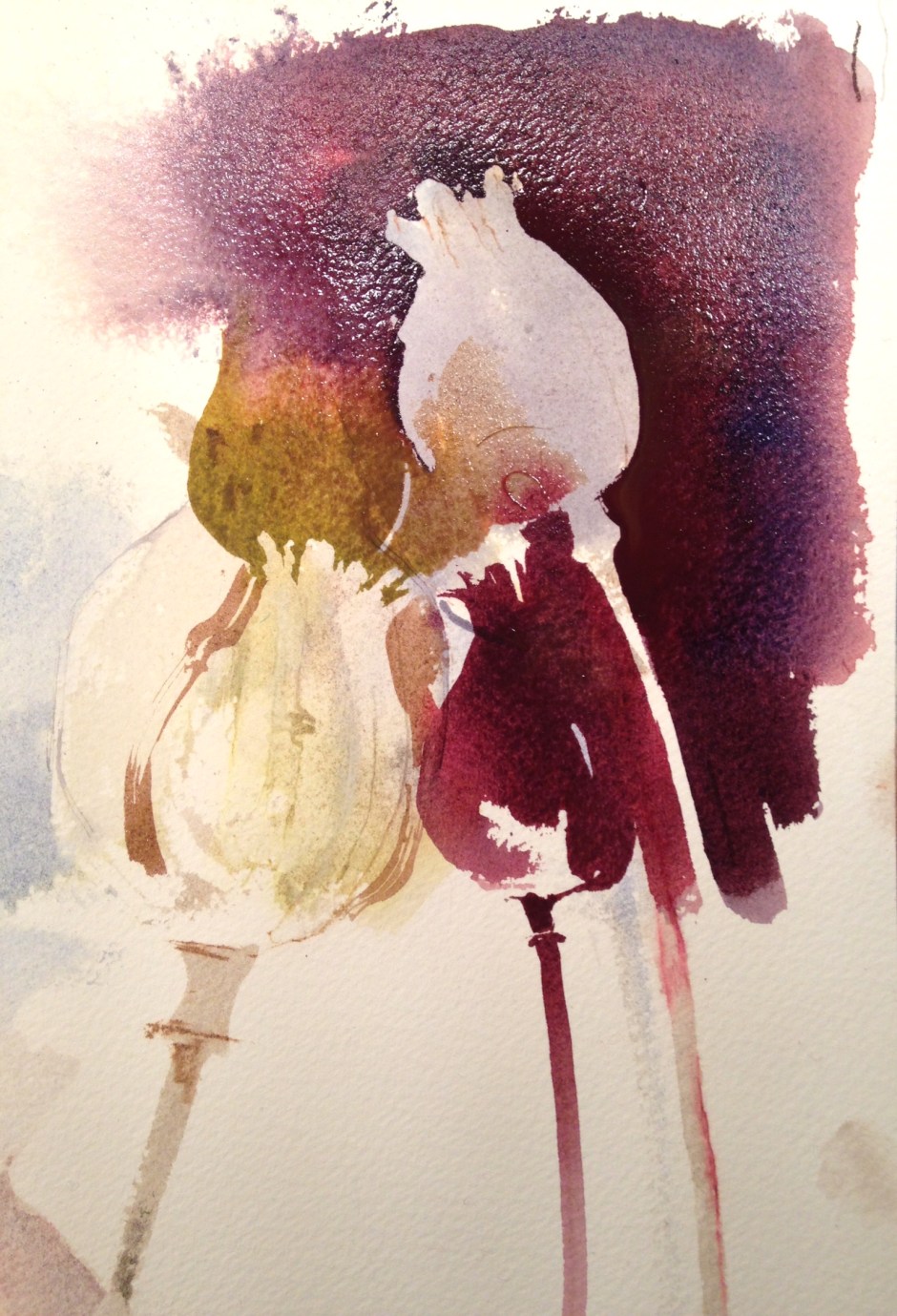
And once dry started to work back into it, pretty much ignoring the original painting, using the same seed head shapes but rather smaller
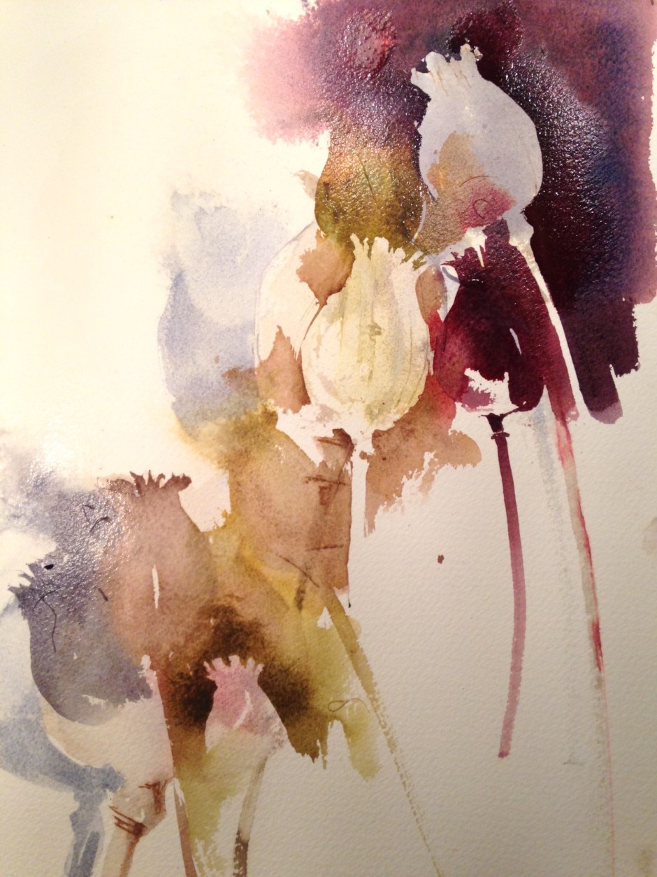
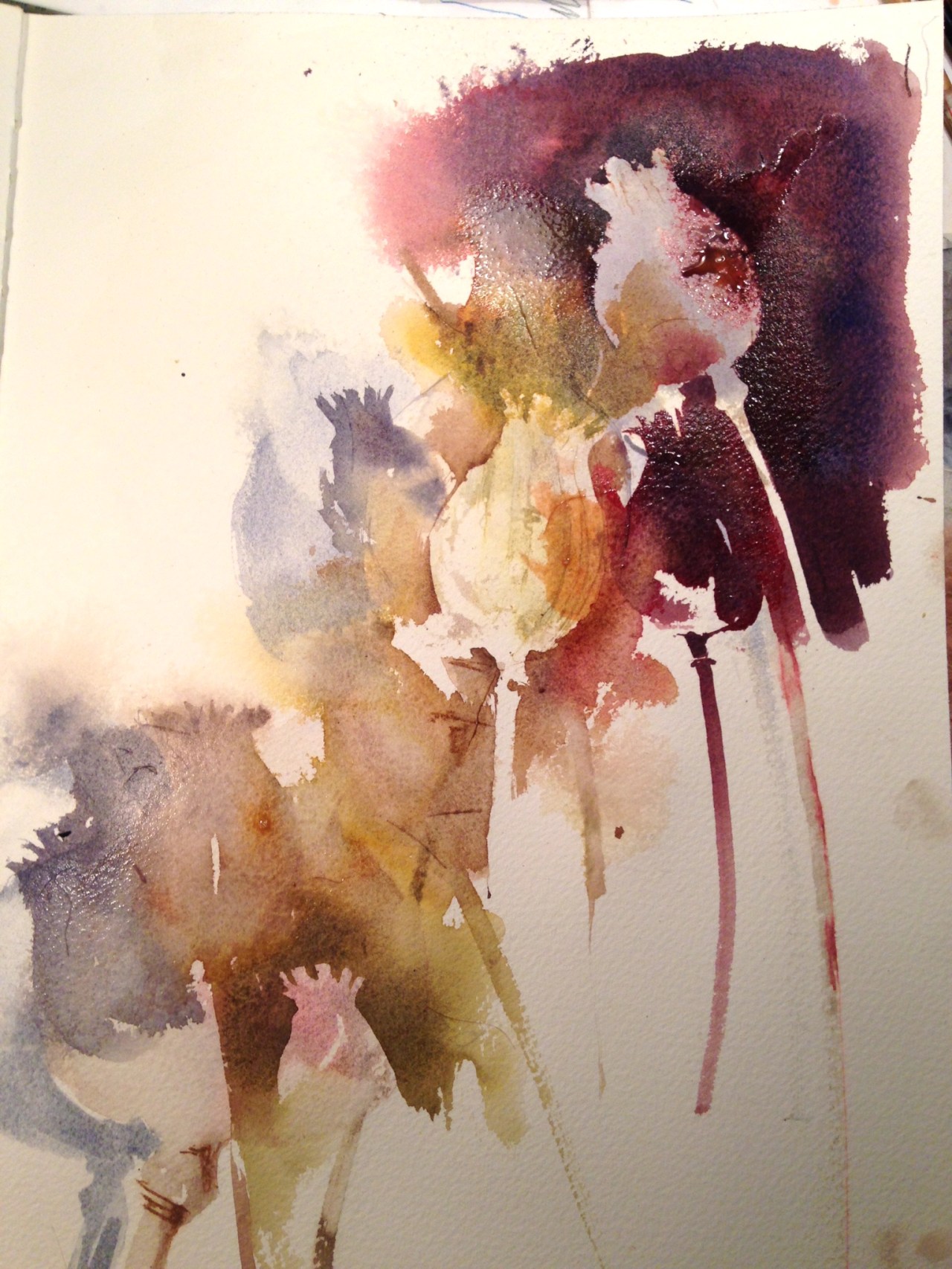
I’m finding and ‘losing’ edges and outlines, painting the seed heads as both positive and negative shapes, using a water spray sometimes to break up hard edges, deepening the tones in some areas and creating a variety of tone across the painting
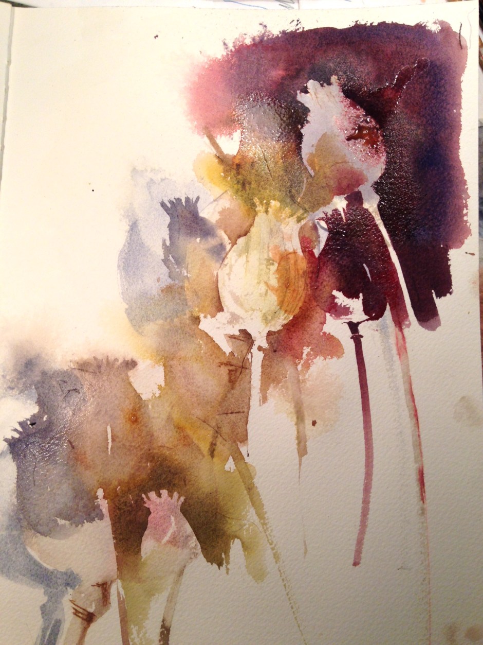
When dry, the pale shape in the centre looked too stark so I added some tone on one side to make it blend in a little more. Finally I added a couple of stems.

gorgeous with the knockout Alizarin! lovely painting Kate 🙂
I love your work for its colour and dashing, calligraphic freedom. But, as a typographer, I liked the first version best because its got a perfect space top left to put some type! I suppose this is how a lot of Chinese paintings work, balancing drawing with lettering.
That’s interesting! We come at these things from different angles of course!
I’d love to know which paper you use Kate – one that takes quite a bit of punishment with washing off?
I’m using Saunders Waterford, usually 300lb as it will take the punishment of a wash down, as will Bockingford, but prefer the off-white tone of the Saunders