At the risk of repeating a repeat, this is a more detailed step-by-step of an earlier sketch; this one done for Artists&Illustrators magazine last summer. Its a large sheet of A1 paper, Saunders Waterford 400gsm, rough. I start in the middle of the arrangement, with the geraniums, below, having first checked where i want this ‘middle’ to be, and how much space is needed for the rest of the composition. I could draw it first, but like to get away with not doing a preliminary drawing when possible. Below are the colours used


The painting is built up rapidly with very wet and fairly pale paint, below, trying to keep edges fluid (and failing in the case of the geraniums in the centre!) and then feeding some these wet areas with more and deeper paint, and with water from a dropper bottle. The paint obviously adds tone and texture, and the water adds light and texture; not very visible at this point, but appearing magically as the paint dries.
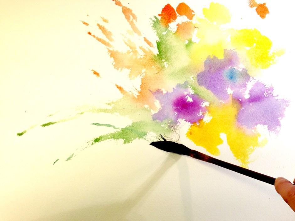


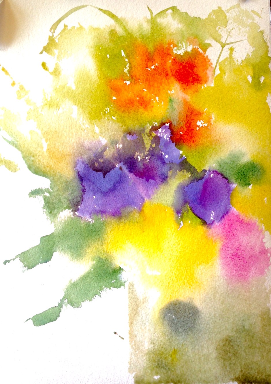
Below is an earlier version, but shows the kind of effect I’m looking for in this early stage, still fluid and undefined, colour bleeding into colour and changes in tone across the page. One thing I notice when teaching is that students are anxious about keeping their forms distinct, and leary of letting stuff ‘happen’. But this is the important understorey, and can be very undefined indeed; you will be painting over a sizeable proportion of it in the second stage, which is the one where you find shape and form
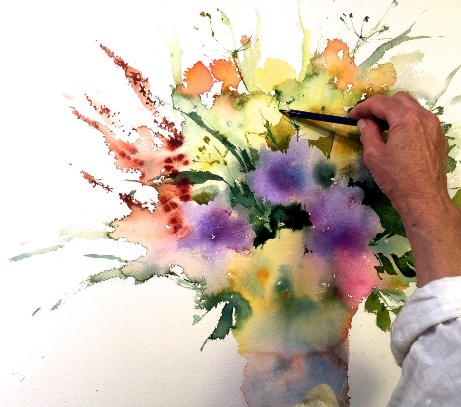
Once I’m happy with the overall shape of the composition and the the amount of paint and water mixing on the page I leave it to dry and once dry start to find those shapes in the centre, mostly, as you can see, below, by painting the dark foliage behind them. At this point I also start to draw details like stamens and stalks with an inktense pencil and Daniel Smith watercolour sticks, into the wet areas mainly but also carrying through into dry areas, which gives a different texture and feel below, I have ‘found’ a lot of shapes, and the painting starts coming together. Here I’m adding finer marks with the Inktense pencil and a fine sword liner, painting the centres of the buttercups, and describing the rose bud economically with few marks


Then the corrugations on the tin are added, below, a mix of burnt sienna and cerulean blue, and you can see the effect of water sprayed from a mister. The struggle is always always not over working a piece, but I tell students, you can’t learn when to stop till you go too far (a few times at least, and even, every now and then, forever)
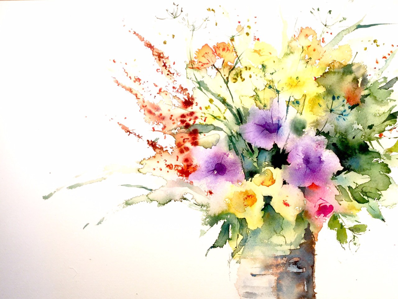
This painting went into a Chalk Gallery exhibition at the Towner Gallery in Eastbourne and, I’m happy to say, sold very quickly (that doesn’t always happen!)


Colours used: trans pyrrol orange, opera rose, transparent yellow, yellow ochre, cerulean blue, russian green, burnt sienna, yellow green

wow, beautiful work! I wouldn’t care if it was a repeated repeat! gorgeous!
Beautiful! thank you! 🙂
Sumptious painting! I do very much appreciate you sharing your techniques.
beautiful splashes of colour, with just the right amount of inferred definition. gorgeous free painting! cheers, Debi
Thanks for lively comments,mfeedback is always appreciated!
That should say lovely and thanks!