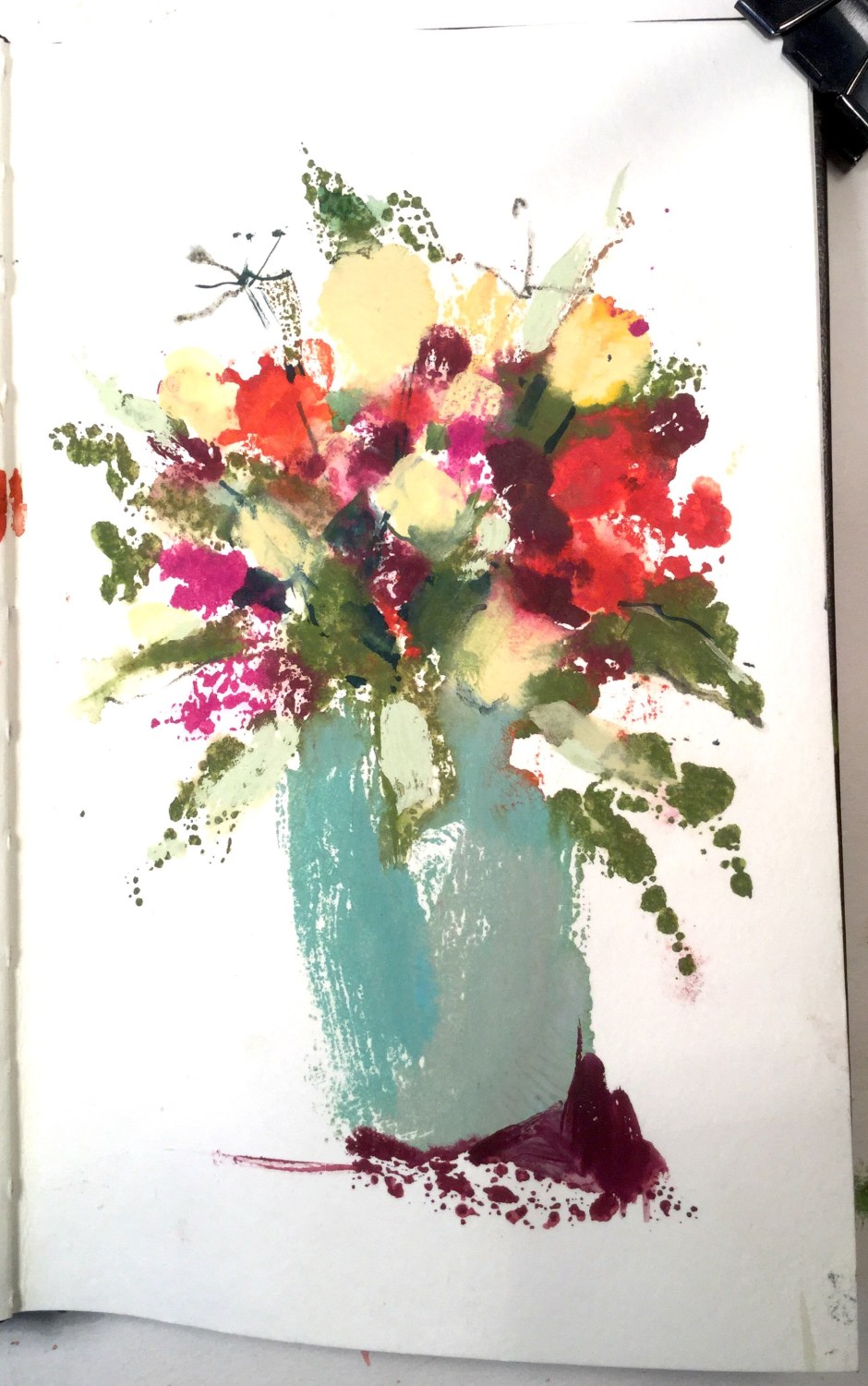
This is about cropping as a useful compositional tool, using a couple of sketchbook monoprints. Below is the initial image, printed using gouache mixed with a little gum arabic, painted onto a sheet of thin acrylic and pressed onto the sketchbook page, then worked back into with watercolour. The whole thing looks rather stiff
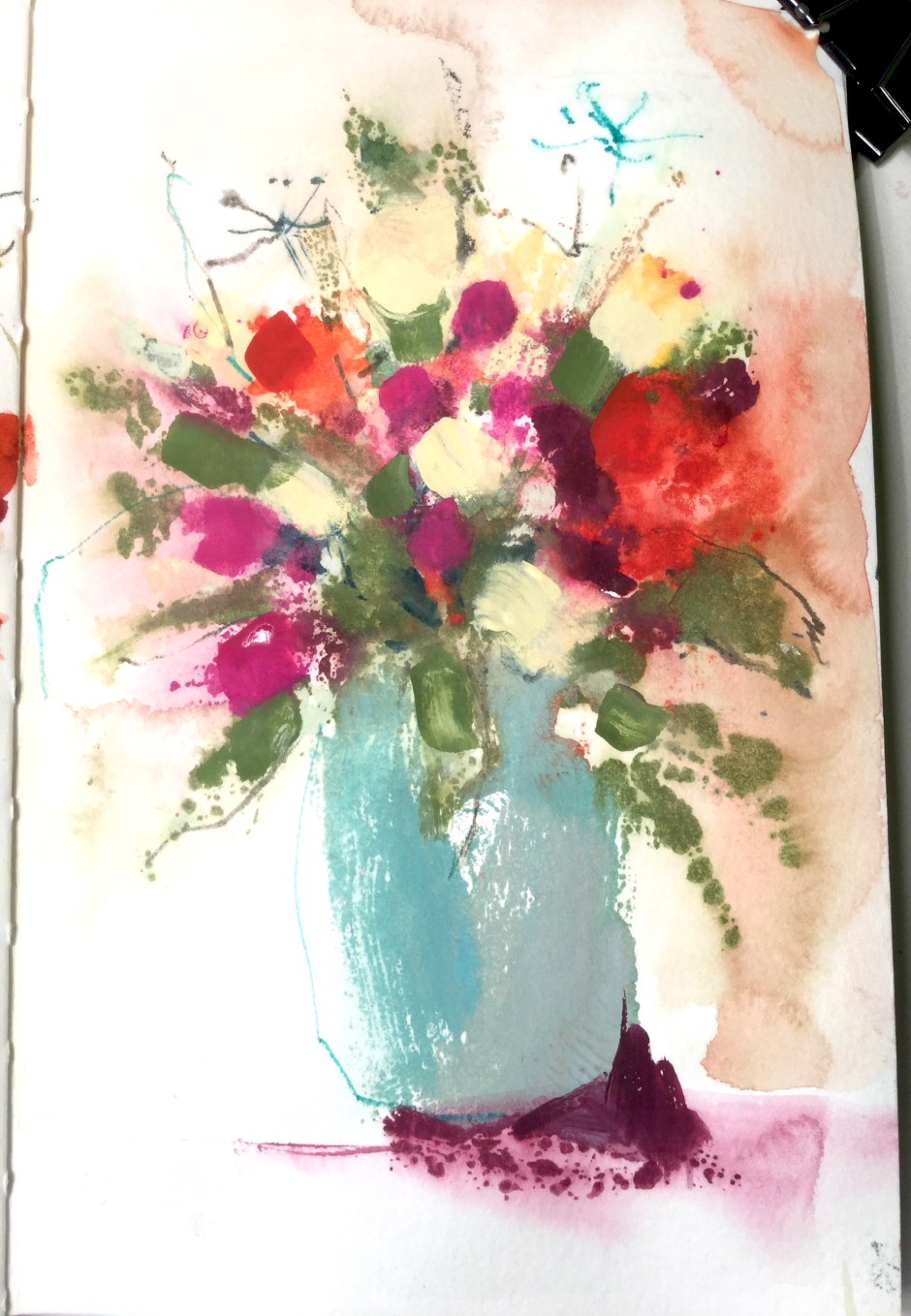
So here, below, it is softened somewhat by washing it down and over painting with more gouache, getting rid of the harsh dark green and some of the maroon, then adding a touch of watercolour crayon.
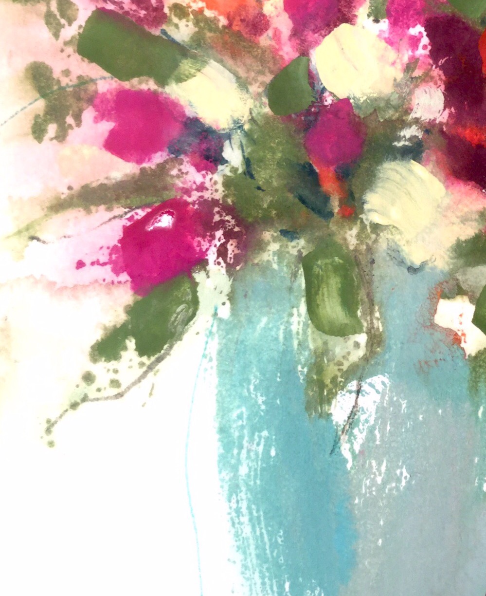
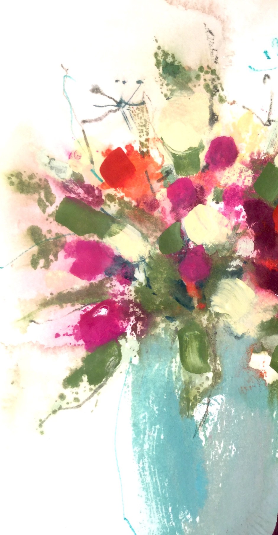
Cropping options. The large red area on the right is too dominant so in the picture below it is cropped out, along with the base of the vase and its shadow. The flowers now fill more of the picture space and the image feels more energetic.
The crop below goes into more of a close up, the marks that are left concentrate that energy even more, there is more focus on the colour, texture and simple shape of the vase, which contrasts with and counterpoints the busier marks of the flowers and foliage. So, for me, it’s reached the right stage from which to take it into acrylics or oils.


Astonishing! I love the final crop.
Thanks Michael!
It really works – stunning! I’ll have to try being more ruthless with my own work – and having read that this was originally a monopring, will definitely be having a go.
Great, am hoping for just that, that people will get inspired to have a go!
Or even monoprint !
delightful!
Kate, absolutely beautiful work and blog! Count me a big fan of what you do! – Douglas
Thank you so much! Have just been taking a look at your beautiful photographs, so you too have a new fan! Kate
Wow Kate, so nice to hear from you! You are inspiring me to get back and paint! Look forward to seeing more of your exquisite sensibilities! 🙂 Cheers! Douglas
That’s kind of you, your own painting is very gorgeous!